
Why Pretty Websites Don’t Convert
Let’s be honest: we all want a beautiful website. One with fancy animations, sleek images, and that “wow” factor that makes visitors pause and admire.
But here’s the truth? Pretty doesn’t always mean profitable.
If you’ve been scouring the internet for website design ideas that actually work—not just look good—then this post is for you. Whether you’re a beginner, a blogger, a content creator, or a small business owner, let’s talk about how to design a site that people use, not just look at.
Why “Beautiful” Websites Sometimes Fail
It’s easy to assume that the more visually stunning your site is, the better it’ll perform. That’s why parallax scrolling, animation overload, and oversized hero videos have become so popular.
But for most of us—not Apple or Tesla—those fancy features can actually hurt conversions.
Why? Because when users land on your site, they’re not here for the cinematic experience. They want answers. Fast.
- What do you do?
- How can you help me?
- What should I do next?
If your site can’t clearly answer those questions in just a few seconds, you’re losing people—no matter how “wow” your design looks.
The Real Goal of Website Design
Before diving into design trends and ideas, let’s ground ourselves:
A website’s main job is to guide visitors toward a goal. That might be:
- Signing up for your email list
- Booking a call
- Reading your latest blog post
- Making a purchase
Every button, headline, color, and layout should quietly nudge them in that direction.
Pretty is great. But purposeful design is what gets results.
7 Website Design Ideas That Actually Work
Let’s look at some beginner-friendly website design ideas that are simple, practical, and focused on one thing: helping your visitors take action.
1. Clarity First: Write Copy That Speaks to Real Doubts
Design starts with words.
When someone lands on your homepage, they should immediately understand:
- What you do
- Who it’s for
- Why they should care
A strong headline with a quick, friendly explanation underneath works wonders. For example:
“Launch Your First Blog Without Tech Overwhelm”
Join 2,000+ creators using our free guide to go from idea to website in a weekend.
Notice how clear and benefit-driven that is?
And don’t be afraid of a little extra copy—just make it skimmable with bold text, icons, or short bullets.
2. Use Social Proof Everywhere
We humans are pack animals. We want to know: Who else has used this? Did it work for them?
Here’s how to add trust to your site:
- Testimonials or reviews
- Client logos (“As seen in…” or “Brands I’ve worked with”)
- User stats (“Join 4,000 subscribers”)
- Awards or recognitions
Even if you’re brand new, you can start with a quote from a happy reader or a beta tester. The more real humans you can show, the more believable you become.
3. Ditch Heavy Animation—Embrace Simplicity
Yes, animation can be cool. But it’s also one of the biggest reasons websites load slowly or distract people from clicking.
If you’re just starting out or designing for conversions, skip the over-the-top effects. Instead:
- Use one subtle animation (like a soft image fade) in the header.
- Focus on guiding the eye to the next section, not entertaining it.
- Keep page transitions smooth and speedy.
Remember, the less your site has to load, the faster people can get to what matters.
4. Highlight the CTA—Make It Unmissable
Your CTA (call-to-action) button is one of the most important elements on the page.
Here’s how to make it pop:
- Use a color that’s only used in the button, nowhere else.
- Make sure it contrasts well with the background.
- Write CTA text that’s specific and inviting.
Compare these:
- “Submit”
- “Send Me the Guide”
That tiny change in wording can increase your clicks significantly. Clear + direct always wins.
5. Design for Speed (Not Wow Factor)
Slow websites kill conversions. And it’s not just about frustration—Google also ranks faster websites higher.
Here’s how to keep things quick:
- Use compressed images (JPG or WebP formats).
- Avoid autoplay videos or huge background graphics.
- Keep your design clean and minimal.
The goal is to help people move through your site easily—not wait around for it to load.
6. Avoid Cognitive Overload
Too many things moving at once? Too many colors, fonts, or menu options?
That’s cognitive overload—and it overwhelms your visitor’s brain. When people get overwhelmed, they bounce.
Here’s what helps:
- Use just 2–3 fonts and brand colors.
- Stick to one goal per page.
- Use whitespace to create breathing room.
Simple = calm. Calm = clarity. And clarity = conversions.
7. Know Your Audience—and Design for Them
This one is huge.
Let’s say you’re selling $20 T-shirts. Your visitors want quick answers and a fast checkout.
But if you’re offering a $2,000 design service or a software solution for hospitals, your audience needs more information, trust, and time.
That means your design might need:
- Longer pages
- Detailed feature breakdowns
- Client case studies
- Subpages that answer different questions
It’s okay for complex websites to have more copy and navigation—as long as it still feels purposeful and easy to follow.
Test, Tweak, Repeat: The Secret to Success
Here’s a little secret: No website gets it perfect the first time.
Even pros tweak their sites constantly—testing different headlines, button colors, layouts, or testimonials.
Try this:
- A/B test two versions of your homepage headline
- Change your CTA button color for a week
- Try adding a testimonial carousel to your about page
Watch how people respond. Keep what works. Ditch what doesn’t.
The more you test, the more your site becomes a fine-tuned conversion machine.
Final Thoughts: Design With a Goal, Not Just a Vibe
Of course, your site should look good. But that doesn’t mean it needs to be flashy, complex, or filled with movement.
Start with what matters:
– Clear messaging
– Trust-building proof
– Simple design choices
– Fast load times
– A strong, visible CTA
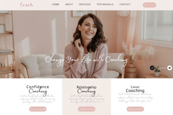
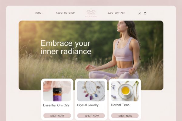
Those are the website design ideas that actually move the needle—whether you’re a blogger, a coach, a digital product creator, or a small business owner.
You don’t need to chase trends. You just need to create a site that connects and converts.
Ready to Optimize Your Site? Choose Colors That Actually Convert?
You’ve just learned how clarity, simplicity, and strategic CTAs boost conversions—but did you know your color choices impact this too?
Get my free Website Color Palette Tool to:
- Skip the guesswork with this tool. You can find the perfect palettes for blogs, shops & service sites.
- Boost trust with pro color combos that make your site look polished instantly
- Increase clicks with high-contrast CTAs (included in every palette!)
Get Started now – No Design Skills Needed!
This tool could save you hours of tweaking!