
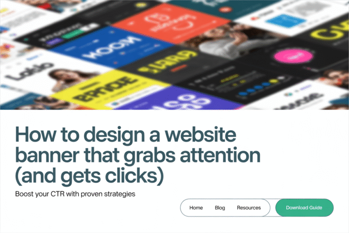
Introduction
Your website banner is often the first thing visitors see—and that makes it prime real estate for making a great impression. Whether you’re showcasing your latest offer, welcoming new visitors, or simply setting the tone for your brand, a strong banner can shape how people feel about your business. In this guide, we’ll break down what a banner is, what it should include, how to design one that works, and how to make sure it fits your website seamlessly.
1. What Is a Website Banner?
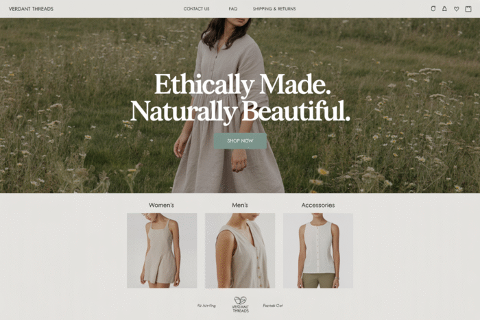
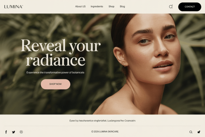
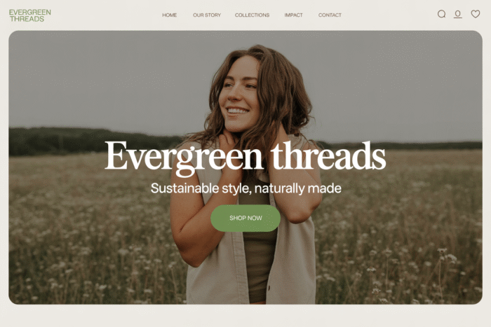
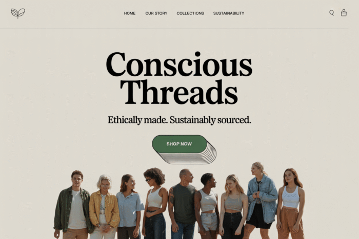
A website banner is a bold, eye-catching element that usually sits at the top of a webpage. Think of it like the welcome mat for your site—it’s where you set the tone, highlight something important, or encourage your visitors to stick around and explore. Banners can announce sales, feature new content, promote a lead magnet, or simply establish your brand’s vibe.
Types of banners you might come across:
- Hero banner: A large section (often with an image and CTA) that greets visitors on the homepage.
- Info banner: A slim announcement bar that sits at the top for quick updates.
- Digital ad banners: These live on other sites and are meant to drive traffic to yours.
Fun fact: The first banner ad was used in 1994 by AT&T! Since then, banners have evolved into design elements that are equal parts aesthetic and strategic.
2. Do Website Banners Actually Work?
They sure do—but only if they’re thoughtfully designed. A banner is like your digital handshake. Done well, it creates interest, builds trust, and drives clicks. Done poorly, it just takes up space (or worse, annoys your visitors).
Here’s why banners work:
- They set the stage for your site’s messaging.
- They focus attention on your most important offer or action.
- They guide the user journey by highlighting what to do next.
But here’s the catch—people are bombarded with visuals online. So your banner needs to be clear, compelling, and aligned with your audience’s goals. If it looks like a flashy ad, visitors might tune it out. If it blends in too much, they might not notice it at all.
Pro tips:
- Pair your banner with a strong value-driven headline.
- Make sure it loads fast.
- Keep it mobile-friendly.
3. What Should Be Included in a Website Banner?
A great banner balances design and messaging. You want to catch attention without overwhelming your visitor.
Key elements to include:
- Headline – Keep it short, clear, and focused on a benefit.
- Subheadline (optional) – Add a quick detail or supporting message.
- Call to Action (CTA) – A button or link that tells people what to do next (like “Shop Now” or “Learn More”).
- Background – A clean image, illustration, pattern, or solid color that supports your text.
- Visual add-ons – Icons, arrows, or badges that add interest without cluttering the design.
Ask yourself: What’s the ONE thing I want someone to do after seeing this banner? Then build around that goal.
Copy example: Instead of “Welcome to our site,” try “Ready to transform your workflow? Start your free trial today.”
4. What Should a Good Banner Look Like?
Good banners aren’t about flashy graphics—they’re about clarity and intention. A polished banner makes your site look more professional and helps visitors focus on what matters most.
Design principles to follow:
- Contrast: Make sure text is readable against the background.
- Whitespace: Less is more. Give your content space to breathe.
- Hierarchy: Use font sizes and colors to guide the eye from headline to CTA.
- Consistency: Stick to your brand’s fonts, colors, and style. If you need help picking a color try my free Website Color Palette Tool.
Avoid these common mistakes:
- Cramming too much into the banner.
- Using low-res or overly busy images.
- Vague headlines or unclear CTAs.
A clean, confident banner invites trust and helps visitors feel oriented right away.
5. Website Banner Sizes Explained
There’s no universal size, but there are common dimensions that work well across devices. Choosing the right size helps your banner look sharp and load correctly.
Popular banner sizes:
- Hero banner (full-width): 1920×1080 px
- Header banners: 1600×500 px
- Announcement bars: 1600×100 px
- Ad banners:
- Leaderboard: 728×90 px
- Medium rectangle: 300×250 px
- Skyscraper: 160×600 px
Responsive design tip: Use flexible widths and test how your banner looks on phones and tablets. Canva, Figma, and similar tools often provide templates with these exact dimensions.
6. How to Make a Good Banner for Your Website
Making a banner doesn’t have to be overwhelming—even if you’re not a designer. You just need a plan and a few easy-to-use tools.
Step-by-step:
- Know your goal – Is this banner promoting something? Educating? Branding?
- Choose a layout – Use a design template to save time.
- Pick your visuals – Use high-res photos, custom illustrations, or clean background colors.
- Write clear, punchy text – Focus on one idea.
- Add contrast and breathing room – Keep it legible.
- Include a CTA – Make it easy to take action.
- Test your design on different devices – Mobile view matters!
Canva, Divi (in WordPress), and Adobe Express are great beginner-friendly platforms.
7. Placement Strategies: Where to Use Banners on Your Site
Where you place your banner depends on what you want it to do. Some locations work better for branding, while others are best for conversions.
Top banner placements:
- Hero section (homepage) – Great for setting your brand tone or highlighting your most important offer.
- Sticky info bar – Perfect for updates like shipping info or seasonal sales.
- Blog post banners – Promote a freebie, product, or related post.
- Landing pages – Tailor the banner to the specific campaign.
Quick tip: Avoid stacking banners (like a sticky bar + hero + popup). Too many layers can feel chaotic and lower performance.
8. A/B Testing and Updating Your Website Banner
Just like anything else on your site, banners should evolve with your audience. If a banner isn’t working—change it! The easiest way to improve results is to run a few tests.
What to test:
- Headline tweaks – Try different wording or tone.
- CTA changes – Test button colors, size, or placement.
- Visuals – Swap out background images or test animations.
- Layout – Adjust alignment, spacing, or font styles.
Tools like Google Optimize, Divi split testing, or even heatmaps can help you see what’s working.
Don’t forget to update your banner regularly for promotions, seasons, or product changes. Freshness signals that your brand is active and engaged.
Conclusion
A good website banner is more than decoration—it’s a strategic tool that can attract, inform, and convert your visitors. Whether you’re announcing a sale, showcasing a new product, or simply introducing your brand, a clean, compelling banner makes all the difference. Start with one banner, keep it simple, and test as you go. You’ll be surprised how much it impacts your site’s performance.