
Why Less Really Is More on Your Website
When you’re building your first website—especially as a creator, blogger, or service provider—it’s easy to think you need everything: bold graphics, fancy effects, flashy fonts, and lots of content packed into every corner. But here’s a secret most beginner web designers don’t realize right away:
The most effective websites are often the simplest.
Minimalist website design isn’t just a trend—it’s a powerful way to make your site feel calm, professional, and easy to navigate. And if you’re showcasing creative work, offering services, or trying to build trust with potential clients or readers, minimalist design helps you stay in the spotlight—not your background colors or button animations.
In this guide, you’ll learn:
- What minimalist design actually means (and what it’s not)
- Why it works so well for creators and small businesses
- Simple layout ideas you can copy and customize
- Common beginner mistakes (and how to avoid them)
Whether you’re starting a portfolio, building a blog, or offering your first digital services, this post will help you build a beautiful site that feels just like you—without the overwhelm.
Let’s dive in!
Section 1: What Is Minimalist Website Design?
If you’ve ever landed on a website and instantly felt calm, focused, and inspired—it was probably minimalist.
Minimalist website design is all about keeping things simple, clean, and intentional. That doesn’t mean it’s boring. In fact, some of the most beautiful and professional websites are minimalist because they remove the clutter and spotlight what matters most: your content.
Think of minimalist design like a well-curated art gallery. There’s plenty of space to breathe, only the most important pieces are on display, and there’s nothing competing for your attention. That same feeling can translate to your website—especially if you’re showcasing a creative portfolio.
Minimalist websites often include:
- A calm color palette (just 2–3 main colors)
- Clear typography with only 1–2 fonts
- Plenty of white space to create breathing room
- Simple layouts and navigation
- A single goal or call-to-action per page
For creators like artists, writers, designers, or photographers, minimalist design helps your work take center stage. Instead of crowding your site with graphics, pop-ups, or flashy effects, you’re inviting your visitors to focus on the story you’re telling—through visuals, words, or both.
And if you’re just starting out? Minimalism also means less overwhelm when it comes to designing your site. You don’t need to choose dozens of colors or squeeze in every feature. Just focus on what matters most: your message, your work, your style.
Section 2: Why Minimalism Works So Well for Creators
Minimalism clears the stage so your content can take the spotlight. It removes visual clutter and unnecessary features, making your work feel more intentional, polished, and professional. Instead of trying to impress visitors with fancy animations or busy backgrounds, you let your photos, words, or offers speak for themselves.
Here’s the thing: most people won’t spend more than a few seconds on your site unless something grabs their attention quickly. Minimalist design helps you make a strong first impression by showing only what matters—and nothing more.
And if your goal is to get people to hire you, read your blog, or explore your work, clarity and simplicity are your best tools. You don’t need to “wow” them with effects. You just need great content, a clean design, and a clear next step—like a “Hire Me” or “View Portfolio” button, right where they expect it.
Common Distractions to Avoid on a Minimalist Portfolio Site:
If you want to keep things simple and clear, steer clear of:
- Busy background patterns or video that competes with your content
- Too many fonts (stick with one or two, max)
- Pop-ups or auto-play music/videos
- Image sliders or carousels that distract from your message
- Dropdown menus with tons of links—keep your navigation simple
- Multiple calls to action on one page (stick to one clear choice)
Want a quick win?
Start by simplifying your homepage. Remove anything that doesn’t support your main goal. One bold image, a short sentence, and a single button can often do more than a crowded layout with five competing sections.
Section 3: Key Elements of a Minimalist Creator Website
Now that we’ve talked about why minimalist design works so well for creators, let’s break down the most important elements that make it actually work on a real website. Whether you’re starting from scratch or simplifying an existing site, these key pieces will help your site feel clean, confident, and completely focused on what matters most: your content.
You don’t need to implement every idea at once. Start simple, focus on your goals, and layer in improvements as you go.
1. Whitespace Is Your Friend
Whitespace (also called negative space) simply means the empty areas around your text, images, and sections. It’s one of the most important tools in minimalist design—because it gives your content room to breathe.
When you space things out intentionally, your site feels more relaxed and easier to explore. It also draws more attention to the things that are on the page.
Beginner Tip: Don’t try to fill every inch of your screen. It’s okay for there to be empty space!
Example: A homepage with just one image, a welcome message, and a single button looks more polished than a wall of text and icons.
2. Strong, Simple Typography
Minimalist websites use clean, easy-to-read fonts—and just one or two of them.
Use one font for headings and one for body text. Make sure the size, weight, and spacing are consistent throughout your pages. Avoid using too many styles (like italic, underline, bold, caps) in one area, or it starts to feel chaotic.
Beginner Tip: Choose fonts that reflect your vibe but are still readable. Serif fonts (like Playfair Display) feel elegant and traditional. Sans-serif fonts (like Glacial Indifference or Open Sans) feel modern and simple.
3. A Calm, Limited Color Palette
Using a small color palette helps your site look cohesive and easy on the eyes. Most minimalist designs use 2–3 main colors:
- One background color (often white, light gray, or a soft neutral)
- One primary text color (dark gray, charcoal, or black)
- One accent color (for links, buttons, or headings)
The key is consistency. If every section uses different colors, your site won’t feel minimalist—it will feel disorganized.
Beginner Tip: Choose colors that reflect your brand or creative style, then stick to them.
Need help picking your palette? Use our free Website Color Palette Tool to make this step simple and fun!
4. Simple, Focused Navigation
When someone visits your site, they shouldn’t have to hunt for your portfolio or contact info. Keep your navigation bar clean and minimal—just the essentials.
Example:
- Home
- About
- Portfolio
- Blog (optional)
- Contact
Avoid dropdown menus with multiple levels or too many links. If it’s not a page that supports your creative work or business goals, consider removing it or combining it with another.
Beginner Tip: Put your navigation at the top of the page (or in a sticky header). Use clear, simple page titles—no need to be clever.
5. One Clear Call to Action (CTA)
Every page on your site should have a clear purpose—and ideally, one main action you want visitors to take. Whether that’s hiring you, viewing your work, reading a blog post, or signing up for your newsletter, the CTA should be obvious and easy to click.
Good CTAs for creators:
- View Portfolio
- Book a Session
- Read My Blog
- Contact Me
- Download a free checklist
Make sure your CTA stands out—use a button in your accent color, and don’t surround it with a bunch of competing options.
Beginner Tip: It’s totally okay to repeat the same CTA in multiple places, like once in your homepage intro and again at the bottom of the page.
Bonus Tools & Tips for Beginners:
If you’re just starting out, here are a few extra things that can help bring your minimalist design to life without coding:
- Use a clean website builder: Divi, Squarespace, or Showit all offer minimalist templates you can customize.
- Preview everything on mobile. Minimalist sites shine on phones—make sure your layout works there, too.
- Start with a one-page layout if you’re overwhelmed. You can always expand later.
- Use Canva to create clean, on-brand visuals (like social headers or featured images) that match your color palette.
Section 4: 3 Inspiring Minimalist Website Layout Ideas for Creators
One of the hardest parts of starting your website is staring at a blank page and wondering: “Where do I even start?”
Minimalist design makes this much easier. Because it’s focused and intentional, you don’t need to invent something fancy or complicated. A great layout doesn’t need a lot of moving parts—it just needs to help your visitors understand who you are, what you do, and how to work with you.
Below are three beginner-friendly layout ideas tailored for different types of creators. You can use these as inspiration whether you’re building a personal site, a portfolio, or a simple services page.
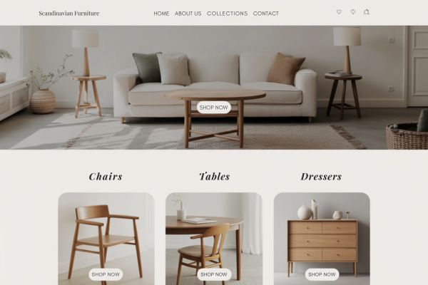
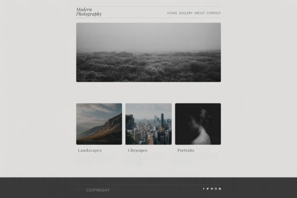
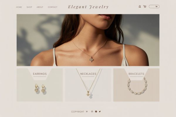
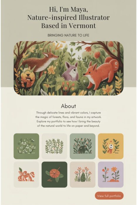
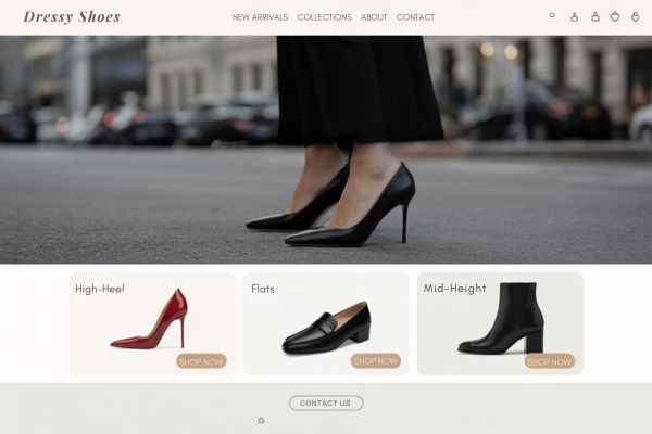
Layout Idea 1: The Artist Showcase
Perfect for: Photographers, illustrators, painters, designers, or crafters
Goal: Let your visuals do the talking
Layout structure:
- Hero section: A full-width image of your best work with your name and a short tagline
Example: “Hi, I’m Maya, a nature-inspired illustrator based in Vermont.” - About blurb: 2–3 sentences about your style, medium, or mission
- Portfolio grid: A clean grid of 6–8 images (no hover effects needed)
- Contact button: One strong CTA that stands out, like “View Full Portfolio” or “Hire Me”
Bonus beginner tips:
- Use a light neutral background to let your artwork pop
- Don’t overload with too many images—curate your best
- Keep descriptions short and consistent underneath each piece
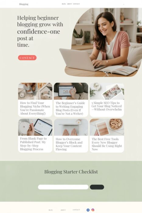
Layout Idea 2: The Thoughtful Blogger
Perfect for: Writers, lifestyle bloggers, educators, or niche experts
Goal: Make reading feel effortless and content feel organized
Layout structure:
- Intro banner: A simple welcome message with a headshot or cozy background photo
Example: “Helping beginner bloggers grow with confidence—one post at a time.” - Blog post grid or list: 6 recent posts with title, date, and short description
- Email opt-in or lead magnet: Offer a freebie like a checklist, worksheet, or your guide
- Clear footer: Include social links and a contact button
Bonus beginner tips:
- Use plenty of space between blog cards or titles
- Choose a legible body font (no script fonts for blog posts!)
- Keep categories minimal (3–5 max) so your site stays tidy
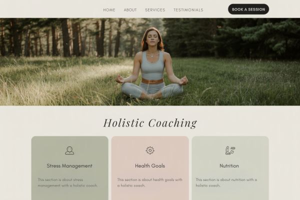
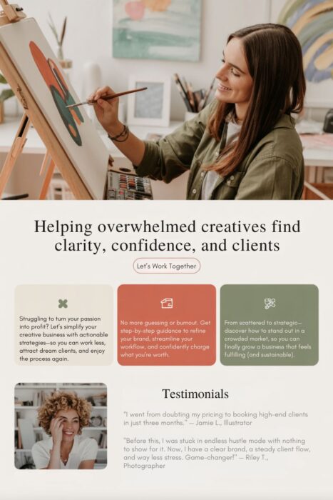
Layout Idea 3: The Creative Coach or Freelancer
Perfect for: Life coaches, consultants, virtual assistants, wellness practitioners, or service providers
Goal: Build trust and encourage people to book or inquire
Layout structure:
- Headline with value: A bold line that states who you help and how
Example: “Helping overwhelmed creatives find clarity, confidence, and clients.” - Service overview: 2–3 short blurbs highlighting your offers
- Testimonial section: Include 1–2 short quotes from past clients
- Call to action: A standout button that says something like “Let’s Work Together” or “Book a Free Call”
Bonus beginner tips:
- Keep each section focused and separated with whitespace
- Use icons or dividers instead of extra images to maintain simplicity
- Highlight your CTA with a unique button color from your brand palette
Choose Your Style with Confidence
Each of these layout ideas can be adapted to fit your unique personality and creative goals. Whether you’re showcasing artwork, writing blog posts, or booking clients, the key is to guide visitors through a clear journey—with no clutter in the way.
Need help picking colors that work beautifully with these layouts?
Use my free Website Color Palette Tool to find soft, creator-friendly color combinations that feel as intentional as your design.
Section 5: Common Mistakes to Avoid in Minimalist Website Design
One of the beautiful things about minimalist website design is that it’s simple—but that doesn’t always mean it’s easy. When you’re first starting out, it’s natural to overthink things or feel tempted to add more than you actually need.
Here are the most common mistakes beginners make with minimalist websites—and how to avoid them:
Mistake 1: Thinking “minimalist” means empty
Minimalism isn’t about having nothing on your site—it’s about keeping only what’s essential. Some beginners remove too much and end up with a site that feels vague or unfinished. A blank homepage with no intro or call to action can confuse your visitors instead of guiding them.
Fix it: Make sure each page still includes enough helpful content—like a short welcome message, a featured image or sample, and a button that tells people what to do next.
Mistake 2: Hiding important links or actions
Minimalist design often uses sleek layouts and small menus—but that can backfire if your most important content is buried or hard to find.
Fix it: Make your navigation simple and easy to scan. Use plain language in your menu (like “Portfolio” or “About Me”), and include clear buttons for important actions like “View Work” or “Book a Call.”
Mistake 3: Using too many fonts or colors
Beginners often try to make minimalist designs “pop” by mixing in a bunch of trendy fonts or vibrant accent colors. But that creates visual clutter, which works against the minimalist goal.
Fix it: Stick to one or two fonts, and choose a calm, limited color palette. (Need help? Use my free Website Color Palette Tool for endless combos that look clean and professional.)
Mistake 4: Adding unnecessary animations or effects
Even simple website builders offer all kinds of fun extras—like image sliders, hover effects, auto-play video backgrounds, and scroll-triggered animations. But using too many of these makes your site feel distracting or slow to load.
Fix it: Keep animations subtle and purposeful. If you use any, make sure they don’t compete with your content. (Tip: A single fade-in effect or a gently animated hero image is more than enough.)
Mistake 5: Forgetting to optimize for mobile
Minimalist sites usually adapt well to phones and tablets—but not always by default. If you haven’t checked how your layout looks on mobile, you might be missing a chance to make a strong first impression.
Fix it: Preview your site on both desktop and mobile before launching. Make sure your text is easy to read, your buttons are tap-friendly, and images don’t overlap or get cut off.
Mistake 6: Being too vague in your copy
Minimalist design often uses short and punchy copy—but if it’s too short, your visitors won’t know what you actually do. Generic phrases like “Creative Solutions” or “Welcome to My World” don’t give enough context.
Fix it: Use clear, confident language that tells people who you are, what you offer, and how they can take the next step. It’s okay to be friendly and personal—especially if your goal is to connect with your audience.
Quick Recap: What to Do Instead
- ✔ Keep your design focused, not empty
- ✔ Guide visitors with clear navigation and CTAs
- ✔ Stick to 1–2 fonts and 2–3 calm colors
- ✔ Use whitespace to create visual breathing room
- ✔ Optimize for mobile early in the design process
- ✔ Use copy that clearly communicates your message
Minimalist websites may look simple, but they’re most powerful when every element is working together with purpose. And don’t worry—your first draft doesn’t have to be perfect. You can always start small and refine your design over time.
Final Thoughts: Start Simple, Grow with Intention
Creating a minimalist website is one of the best ways to let your work shine—especially if you’re just starting out as a creator, blogger, artist, or freelancer. With clean design, clear messaging, and a calm visual style, your site can do exactly what it’s meant to: connect with your audience and showcase your creative voice.
If you’re feeling unsure about what to include (or what to leave out), just remember this: you don’t have to get it perfect to get it started. Minimalist design is beginner-friendly because it’s all about simplicity. You can build a beautiful, effective website without fancy effects or complicated features.
Need help choosing your colors? That part trips up a lot of beginners—so I created a free tool to make it easier.
Use Our Free Website Color Palette Tool
It’s full of curated, creator-friendly palettes that are perfect for minimalist sites. Whether your vibe is soft and minimalist or modern and cozy, you’ll find a combination that fits your style—and your audience.