
Whether you’re a food blogger, a café owner, or someone with a passion for sharing recipes, one thing’s for sure—your website should feel just as satisfying as your favorite meal. Great food deserves great presentation, and that includes your digital plate.
If you’ve been searching for food website design inspiration that makes visitors say “YUM” at first glance, you’re in the right place. In this post, we’ll explore 10 delicious design ideas that are beautiful, functional, and totally doable—even if you’re not a web designer.
So grab a snack and let’s dig in 🍽️
Why Food Website Design Matters
You already know this: we eat with our eyes first. That’s exactly why your website’s look and feel matters so much in the food world.
A well-designed food website:
- Makes your food look even more crave-worthy
- Builds instant trust and credibility
- Helps your readers or customers find what they’re looking for quickly
- Reflects your unique personality or brand flavor (pun intended)
In today’s scroll-happy world, people will judge your site in seconds. A beautiful design ensures they stay long enough to click, cook, or order.
10 Food Website Design Ideas to Inspire Your Next Refresh
You don’t need to reinvent the recipe to have a stunning site. These 10 design styles will give you the creative boost you need—whether you’re starting from scratch or giving your site a makeover.
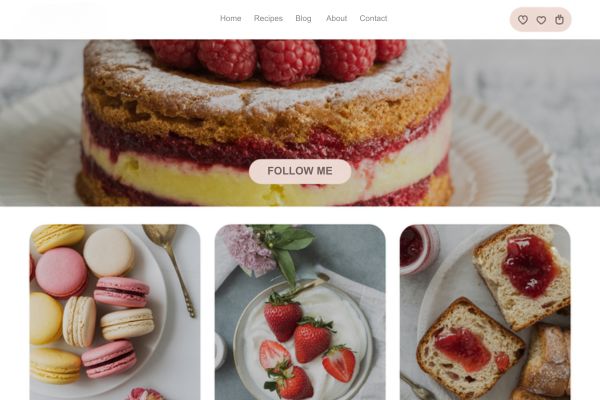
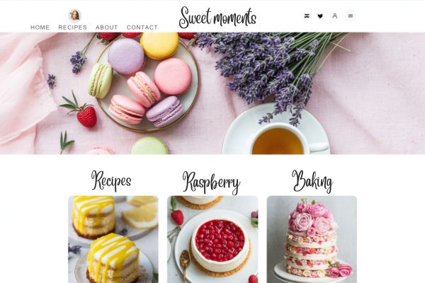
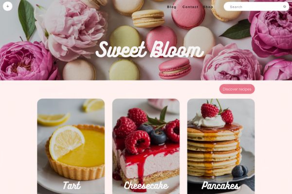
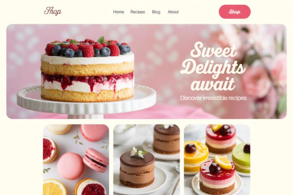
1. Bold Hero Image + Menu Buttons
Perfect for: Restaurants or cafés
Make your food the star! A large, full-width image of your most tempting dish (or a short video loop of sizzling, pouring, or slicing) is hard to resist. Right below? Clear buttons like “View Menu,” “Book a Table,” or “Order Now.”
Design Tip: Use a dark overlay on your image so the text pops. Stick with 2–3 key actions, and make the buttons bold and easy to tap.
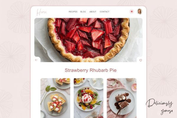
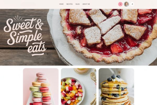
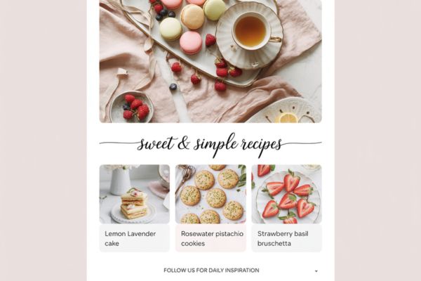
2. Recipe Grid with Hover Effects
Perfect for: Food bloggers
Want your recipes to shine? Try a Pinterest-style grid layout that shows off your featured photos. When someone hovers over an image, display the recipe name, cook time, or a cute animation (like a heart or utensil icon).
Design Tip: Use high-quality thumbnail images that are cropped consistently for a tidy look. Keep the hover effects fun but simple!
3. Earthy, Organic Aesthetic
Perfect for: Health coaches, vegan brands, or sustainable food bloggers
This design style feels fresh and grounded. Think sage green, oatmeal beige, natural textures like linen or paper, and handwritten fonts. It works beautifully with outdoor photography or lifestyle-focused content.
Design Tip: Add leaf or seedling icons, use muted tones, and avoid anything too shiny or digital. Let your content breathe.
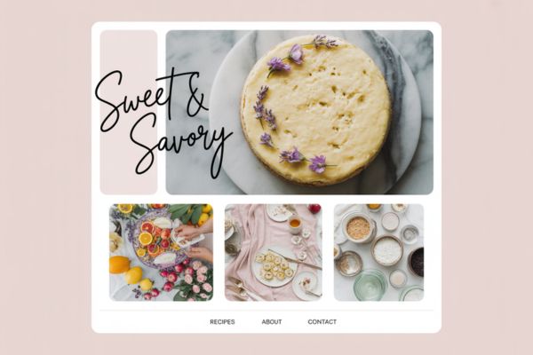
4. Elegant & Minimal
Perfect for: Fine dining, personal chefs, or upscale food brands
Sometimes less is more. A minimal layout with generous white space, crisp typography, and clean lines lets your food photography take the lead. It’s timeless and professional—ideal if you want to feel high-end.
Design Tip: Choose one serif font for headlines and a clean sans-serif for body text. Use neutral colors and one accent tone (like gold, plum, or charcoal).
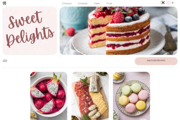
5. Vibrant & Fun
Perfect for: Street food bloggers, snack brands, or cooking class creators
Want something bold and energetic? Go for it! Use bright colors, rounded fonts, and playful shapes. This look screams joyful food vibes—great for kid-friendly content or upbeat personalities.
Design Tip: Add doodles (like smiling fruits or cartoon utensils), use bold headings, and don’t be afraid of a color pop background.
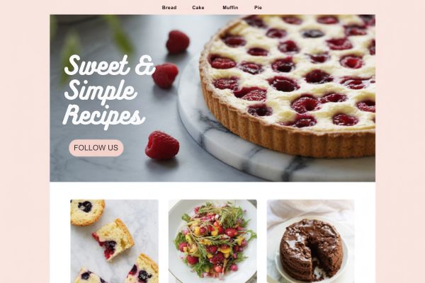
6. Menu-Focused Landing Page
Perfect for: Takeout, pop-up kitchens, or delivery businesses
Sometimes all you need is one great page. Use a single landing page that showcases your menu with categories (starters, mains, desserts), a few tasty photos, and a big “Order Now” button that links to your ordering system.
Design Tip: Keep the layout scrollable and clean. Use contrasting colors for your CTA buttons and include only essential info (menu, location, hours, contact).
7. Illustrated or Hand-Drawn Theme
Perfect for: Bakeries, small-batch shops, or nostalgic food blogs
This style is full of charm. Add custom illustrations of ingredients, cakes, or even your kitchen tools. Hand-drawn icons, borders, or dividers can make your website feel like a cozy recipe notebook.
Design Tip: Use textured backgrounds (like paper or chalkboard) and mix hand lettering with simple typefaces to balance personality with readability.
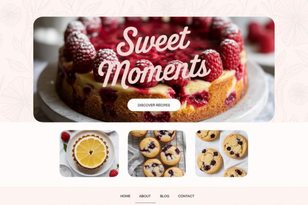
8. Storytelling Layout
Perfect for: Chefs, farm brands, or food travel blogs
Food is full of stories—your design can be too. Use a long-scroll layout that guides visitors through your journey: where your ingredients come from, what inspires your cooking, and how people can connect with you.
Design Tip: Use large images, overlapping text blocks, and soft transitions between sections. Add a personal video or behind-the-scenes shots for bonus connection.
9. Interactive Recipe Cards
Perfect for: Bloggers, cooking instructors, or meal planners
People love recipes they can save, print, or rate. Use dynamic recipe cards that let users check off ingredients, adjust serving sizes, or add reviews. Bonus: you can embed video tutorials or step-by-step image galleries.
Design Tip: Use a plugin like WP Recipe Maker or Tasty Recipes on WordPress. Choose a clean layout and brand it with your colors and fonts.
10. Product-Centered Ecommerce Design
Perfect for: Food products (sauces, spices, snacks, mixes)
Have something to sell? Build a shop layout that puts your products front and center. Use beautiful product shots, flavor filters (e.g. “sweet,” “spicy,” “gluten-free”), and short, tempting descriptions.
Design Tip: Include customer reviews, bundle offers, and fun copy like “Try Me with Tacos” or “Fan Favorite.” Add badges for “New” or “Bestseller” to draw attention.
Tips for a Delicious-Looking Website
No matter which style you love, here are a few extra tips to make your food website chef’s kiss:
- Invest in good photography. Whether you take them yourself or buy high-quality stock, sharp, well-lit images are non-negotiable.
- Make it mobile-friendly. Many people will view your site from their phone while cooking, ordering, or browsing.
- Choose a cohesive color palette. Think warm, fresh, or rich tones—depending on your vibe.
- Keep it simple. Too many fonts, animations, or colors can overwhelm visitors (and slow down your site).
- Use tools made for creatives. WordPress with Divi is great for custom sites, Canva for graphics, and Shopify for ecommerce.
Sweeten Your Site with Irresistible Website Color Palettes
Just like the perfect frosting pairing, your website colors should complement your treats without overpowering them.
Use my free Website Color Palette Tool to:
- Get your mouthwatering website palettes (think bakery pastels, rich chocolate tones, and fruity brights)
- Ensure readability over food photography (no more unseeable text!)
- Make your treats pop with scientifically-proven appetite-boosting hues
These palettes could make your cupcake blog look good enough to eat
P.S. Includes color codes to keep your site cohesive!