
DIY Web Design Inspiration
Designing your own website when you’re not a designer can feel like trying to assemble IKEA furniture without instructions.
But here’s the truth: You can create a gorgeous, professional-looking site without a fancy design degree or massive budget.
Whether you’re building a blog, launching a side hustle, or finally turning that hobby into a business, these DIY web design tips will help you feel confident, creative, and totally in control.
These tips are packed with web design inspiration business-style, and they’re perfect for Pinterest because everyone loves a good glow-up that doesn’t break the bank.
Let’s dive in.

1. Choose a Clean, Easy-to-Read Font Combo
Fonts might seem like a small detail, but they can make or break your whole site. Clashing or hard-to-read fonts instantly make things feel messy. Instead, stick to a simple combo: one font for your headlines and one for your body text. Two fonts are more than enough—and they should play well together.
A good beginner trick? Try pairing a classy serif font (like Playfair Display or Cormorant) for your headings with a modern sans-serif (like Lato, Open Sans, or Montserrat) for your paragraphs. This combo feels balanced, professional, and stylish without being fussy.
Google Fonts is full of great free options, and most website builders make it easy to plug them in. Keep your fonts consistent across all your pages and your site will instantly feel more polished.
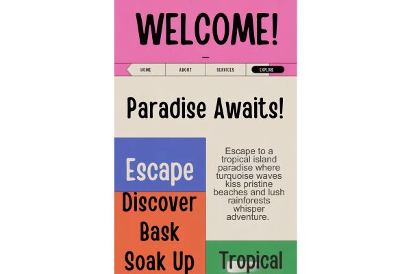
2. Pick a 3- to 5-Color Palette and Stick to It
Ever visit a site that’s got hot pink, navy, neon green, and gold all fighting for attention? Yikes. Choosing a small, intentional color palette helps your brand feel cohesive and calming. You don’t need to be a color expert—just pick a main brand color, one or two accents, and a couple of soft neutrals (like beige, gray, or white) to balance things out.
Think of your brand’s vibe: Are you aiming for cozy and calm? Go with muted tones like blush, sage, or lavender. Want bold and creative? Try coral, teal, or mustard. Tools like Coolors or Pinterest searches make it super easy to explore palettes and find one that fits you.
Once you pick your colors, use them consistently—on buttons, backgrounds, text, and graphics. That visual rhythm makes everything look intentional and stylish.
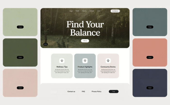
3. Use a Grid Layout to Keep Things Clean
A clean layout can take your DIY site from “homemade” to “hello, pro!” fast. One of the best ways to do that is to follow a grid layout. Grids help keep everything lined up neatly and spaced out with breathing room—especially important on mobile where space is limited.
Most website builders like Divi, Squarespace, or Showit let you build sections using columns or rows. Stick with 2- or 3-column layouts and use padding between blocks. That space (called white space) keeps your design from feeling squished or chaotic.
Also, align your content consistently—don’t have text centered in one section and left-aligned in another unless you’re doing it on purpose. A good grid makes your content easier to read and more enjoyable to scroll.
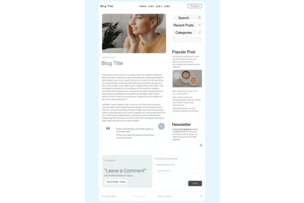
4. Stick with Just a Few Page Templates
You don’t need a brand-new design for every single page. In fact, using just a few page templates is actually better. It keeps your site looking consistent and makes updates way easier. Most beginners only need three main layouts: a homepage, a blog post page, and a services or “about” page.
When every page follows a familiar structure, visitors feel more at ease—they don’t have to figure out how each page works. That builds trust and helps guide them through your content.
Don’t overthink it. Choose a clean layout you like and use it across all your pages with minor tweaks. Keep things simple, and your site will look like it was built by someone who knows exactly what they’re doing—even if you’re still learning.
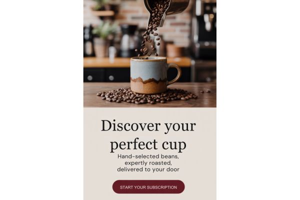
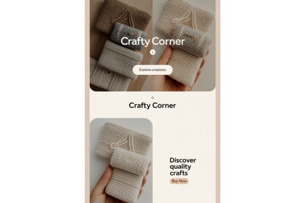
5. Use High-Quality Images (Even Free Ones)
Nothing drags down a site faster than blurry, dark, or awkward stock photos. But the good news is, there are tons of high-quality, totally free images you can use. Sites like Unsplash, Pexels, and Kaboompics have thousands of beautiful, professional-looking images that work for blogs, portfolios, and business sites.
Choose images that match your vibe. If you’re soft and cozy, pick light, airy photos. If you’re bold and creative, go for high contrast or colorful shots. And don’t forget: you can customize images in Canva to add your brand colors, overlays, or text.
High-res photos give your website an instant boost. Even the simplest site layout can look amazing if your images are sharp and on-brand.
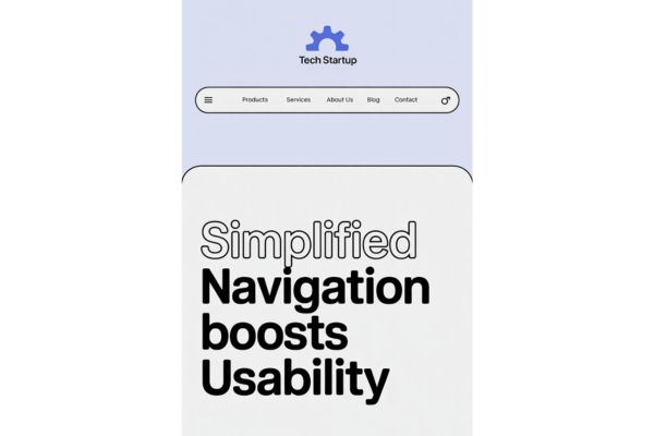
6. Nail Your Navigation (Keep It Simple!)
Website menus should be easy, not overwhelming. If visitors can’t find what they’re looking for in a few seconds, they’ll click away. Your top menu should include just the essentials: Home, About, Blog, Services (or Shop), and Contact. That’s really all you need to start.
Keep your menu at the top of the page, make sure it’s visible on mobile, and use short, clear labels. No one wants to guess what “Magic Vault” means (unless it’s your actual product name—and even then, add context).
Good navigation keeps people engaged and makes your site feel trustworthy and user-friendly. If you’re not sure what to include, look at websites you love and notice how they organize their menus.
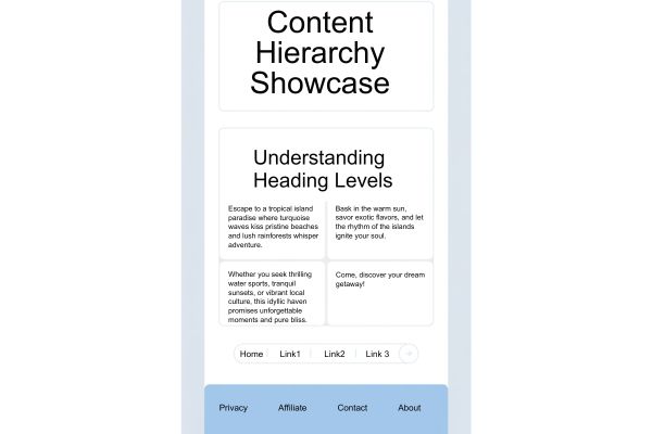
7. Create Visual Hierarchy with Font Sizes and Sections
Your website should feel like a story—one where readers can skim and still get the main idea. That’s where visual hierarchy comes in. Use bigger fonts for headings, medium ones for subheadings, and regular size for paragraphs. Don’t be afraid to make key points bold or use blocks of color to separate sections.
A great DIY trick is to use heading tags the way they’re meant: H1 once at the top (usually your page title), H2s for major sections, and H3s for smaller points. This not only helps your readers—but also improves your SEO (search engine visibility).
Add space between sections so content doesn’t feel crammed. A clean layout with clear structure helps guide your readers exactly where you want them to go.
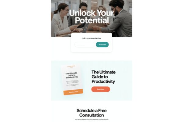
8. Add Clear, Confident Call-to-Action Buttons
Want people to sign up, shop, or contact you? Tell them exactly what to do—with buttons that pop. Call-to-action buttons (CTAs) are those clickable spots that lead your visitors to their next step. Make your CTAs short, clear, and action-oriented—things like “Book a Call,” “Grab the Freebie,” or “Start Reading.”
Use your brand’s main accent color so your buttons stand out, and don’t crowd them with other links or clutter. Give them plenty of space and make sure they’re mobile-friendly (big enough to tap!).
Your website shouldn’t be shy—it should confidently invite people to connect with you, and a great CTA is how you make that happen.
9. Test Your Site on Mobile (Seriously)
Let’s be real—most of your visitors are coming from their phones, especially if they’re clicking over from Pinterest. That’s why testing your site on mobile isn’t optional—it’s essential. Browse your site on your own phone and see how it really looks.
Is the text easy to read? Are the buttons large enough to tap without zooming? Does anything feel squished, off-center, or slow to load?
Most DIY site builders have a mobile preview tool—use it to make adjustments. You might need to add extra spacing or tweak font sizes just for mobile. A smooth mobile experience tells your audience you care about the details (and keeps them sticking around).

10. Make It Personal—Add YOU!
Your website isn’t just about your content—it’s about you! Whether you’re a coach, blogger, artist, or side hustler, your readers want to know the person behind the screen. That’s why adding personality is one of the most powerful things you can do.
Use a friendly photo, write like you talk, and let your quirks and passions shine. Share a quick welcome message on your homepage or tell a fun story in your “About” page.
You don’t need to overshare—just give people a reason to connect with you as a real person. Personality builds trust and makes your site memorable.

Bonus Section: Favorite DIY-Friendly Tools for Web Design
These beginner-friendly tools make designing a website way easier and way more fun:
- Free Website Color Palette Tool – for designing cohesive colors
- Canva – for creating graphics, Pinterest pins, and custom brand visuals
- Unsplash / Pexels – for finding beautiful free photos
- Divi / Showit – drag-and-drop website builders with tons of flexibility
- Google Fonts – huge collection of free, web-safe typefaces
Use these tools to experiment, build, and polish as you go!
Final Thoughts: You’re More Creative Than You Think
You don’t need to wait for “someday” to launch your business or blog. You can start today, with just a few smart decisions and a little creativity. These DIY design tips are meant to guide you, not overwhelm you—and every single one is totally beginner-friendly.
So pick your fonts, test those colors (use my free Website Color Palette Tool), and press publish. You’ve got this—and the world needs what you’re building.