
Business Web Design Inspiration
You know that moment when you land on a website and instantly feel something? Whether it’s calm, joy, trust, or excitement—that vibe comes straight from the colors.
If you’re building or revamping your site and you want to finally have that “wow, this feels like me” moment, you’re in the right place.
Below are six color palette ideas to help you create a website that not only looks beautiful but also supports your blog-turned-business goals.
This is all about web design inspiration business style—where looks meet purpose.

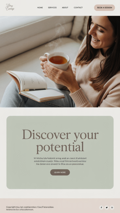
1. Soft Neutrals for Coaches & Wellness Bloggers
Palette: Ivory · Warm Taupe · Sage Green · Blush · Stone Gray
This color palette is calm, cozy, and trustworthy—perfect for life coaches, wellness bloggers, or anyone offering services that require a sense of peace and professionalism. Think yoga instructors, mindset mentors, or holistic health creators.
Why it works: It’s gentle on the eyes and helps visitors feel safe, which is exactly what you want if you’re inviting them to work with you or trust your advice.
Best for: Coaching, wellness, journaling blogs, slow living or spiritual content
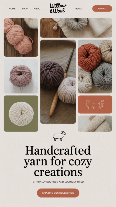
2. Earthy Boho for Handmade Creators & Nature Bloggers
Palette: Terracotta · Clay · Olive · Cream · Dusty Rose
This one’s for the creatives with a boho spirit—think crochet bloggers, DIYers, printmakers, and eco-friendly small business owners.
Why it works: These grounded, earthy colors feel organic and handcrafted. They give your site that warm, artisan vibe that Pinterest loves.
Best for: Craft blogs, handmade shops, sustainable living sites
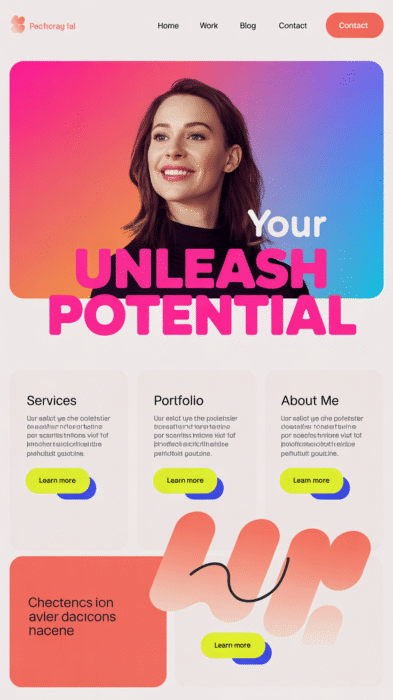
3. Bold and Bright for Content Creators & Influencers
Palette: Hot Pink · Sunshine Yellow · Electric Blue · White · Coral
If your brand is bursting with energy (and you want your audience to feel it), this vibrant palette is your secret weapon. It’s fun, punchy, and made for creators who are ready to stand out.
Why it works: High contrast grabs attention and helps you look confident, current, and full of personality.
Best for: TikTokers, lifestyle bloggers, podcasters, and online educators with big energy
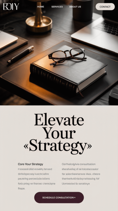
4. Elegant Dark Mode for Experts & Thought Leaders
Palette: Charcoal · Deep Plum · Gold · Ivory · Slate Blue
This is moody, polished, and just a little mysterious. If you’re building a brand that’s more luxe or intellectual—maybe you’re a consultant, author, or speaker—this color combo gives depth without feeling cold.
Why it works: Dark mode sites feel modern and authoritative. Paired with pops of gold or ivory, it’s both classic and creative.
Best for: Business consultants, speakers, writers, designers with a high-end edge
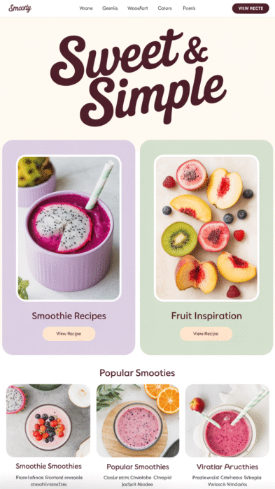
5. Pastel Play for Food Bloggers & Smoothie Creators
Palette: Lavender · Mint · Peach · Cream · Aqua
Light, fresh, and sweet—this palette works beautifully for health food bloggers, smoothie recipe sites, or anything that feels lighthearted and refreshing. It also pairs great with flat lay photography and Pinterest-perfect visuals.
Why it works: Pastels instantly evoke joy and approachability. If your blog is about making life easier and tastier, this is your match.
Best for: Food blogs, recipe sites, health coaches, smoothie eBook sellers
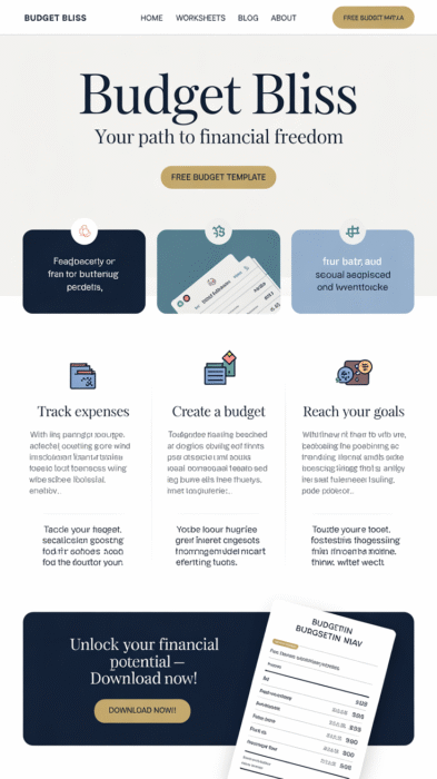
6. Classic Chic for Budget Bloggers & Productivity Gurus
Palette: Navy · White · Soft Gold · Pale Gray · Dusty Blue
This is your classic, dependable palette that feels smart and structured without being boring. It works wonders if your blog helps people with money, planning, time management, or life organization.
Why it works: Navy signals trust and clarity, while soft gold and dusty blue add polish and calm. It’s timeless and Pinterest-friendly, especially for printable lovers.
Best for: Budget bloggers, printable shops, planners, habit tracking blogs
How to Choose the Right Palette for Your Website
Choosing a color palette isn’t just about picking your favorites. It’s about picking a mood that helps visitors feel at home and understand what your site is about within seconds.
Here’s a quick trick:
- Think of three words that describe your brand vibe. (e.g., peaceful, trustworthy, cozy)
- Look for a palette that supports that vibe
- Always test colors with your fonts and photos before finalizing
Need help? Don’t waste time testing colors—use my free Color Palette Tool and launch your dream site today!
Final Thoughts: Your Website Deserves to Feel Like You
Your color palette is one of the fastest ways to go from “meh” to “wow” without hiring a full design team.
Whether you’re building a budget printable shop, a recipe blog, or a life coaching biz, the right colors can boost your confidence, clarity, and conversions.
Your website doesn’t just need to look good—it needs to feel like home for your dream audience.
So choose your palette, make it yours, and watch the magic happen.