
Web Design Inspiration Layout
If you’re a freelancer, coach, or consultant staring at a blank website builder wondering “What the heck should go on my homepage?” — this one’s for you.
Your homepage is your digital first impression. It should not only look amazing but guide your visitors to exactly what they need to do next.
But here’s the good news: you don’t have to reinvent the wheel. There are homepage layouts that just work — for real humans and real service-based businesses.
So today we’re walking through 8 homepage layout ideas that combine good looks, good flow, and good business sense. These are layouts anyone can build — even if you’re designing your site DIY-style.
Each one includes a visual image prompt so you can sketch it, or use Divi WordPress Theme to recreate it.
Let’s get into it!

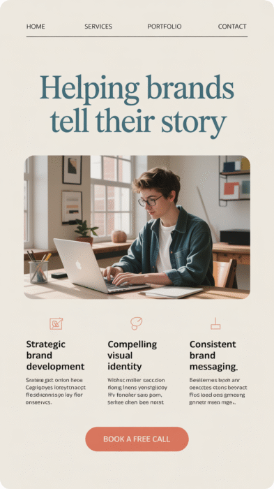
1. The “Hero First, Book Now” Layout
Perfect for: Freelancers who want quick conversions
This homepage layout jumps straight into your core service and call to action. Visitors instantly know what you do and how to work with you.
Sections in Order:
- Full-screen hero image or headline
- Short intro blurb
- “Book Now” or “Get Started” button
- Key benefits
- Social proof (testimonials, logos)
Why it works:
Busy people love clear info and fast action. This layout gets straight to the point.
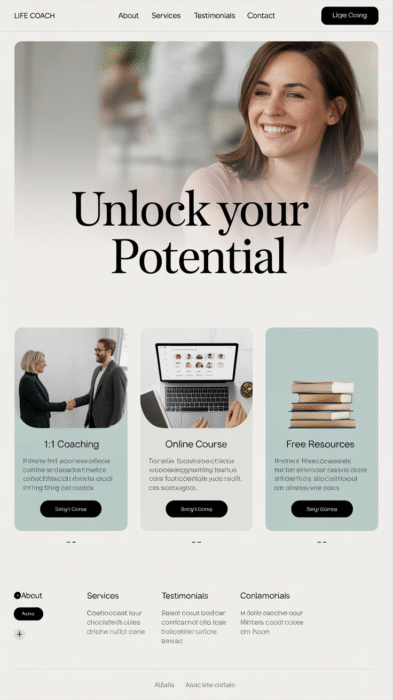
2. The “Pathway Pick” Layout
Perfect for: Coaches or consultants with multiple offers
This layout lets users choose their own journey. Whether someone wants 1:1 services, group programs, or free content, this layout makes it easy.
Sections in Order:
- Intro headline with value statement
- 2–3 clickable “paths” (e.g., “Work With Me,” “Take the Quiz,” “Join the Course”)
- Brief description of each path
- Testimonials
- About section preview
Why it works:
Visitors self-sort, which means fewer confused leads and better conversions.
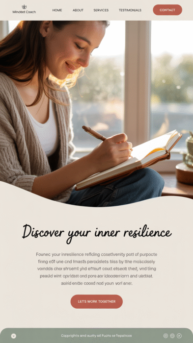
3. The “Story Sell” Layout
Perfect for: Personal brands and mindset coaches
This layout opens with a personal connection before transitioning into your offer. Great for brands that lean on storytelling, vulnerability, or transformation.
Sections in Order:
- Story-based headline
- Personal story or pain point you help with
- The turning point
- CTA (Work With Me or Learn More)
- Social proof and results
Why it works:
It builds trust and emotional connection right away.
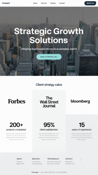
4. The “Expert Authority” Layout
Perfect for: Consultants or professionals in serious industries
Want to look polished and professional right out of the gate? This layout starts with results, credentials, and trust-building proof.
Sections in Order:
- Strong headline with promise/result
- Case study preview or client logos
- Overview of your signature service
- Testimonials or metrics
- CTA
Why it works:
Trust and authority sell — especially in B2B, finance, or legal industries.
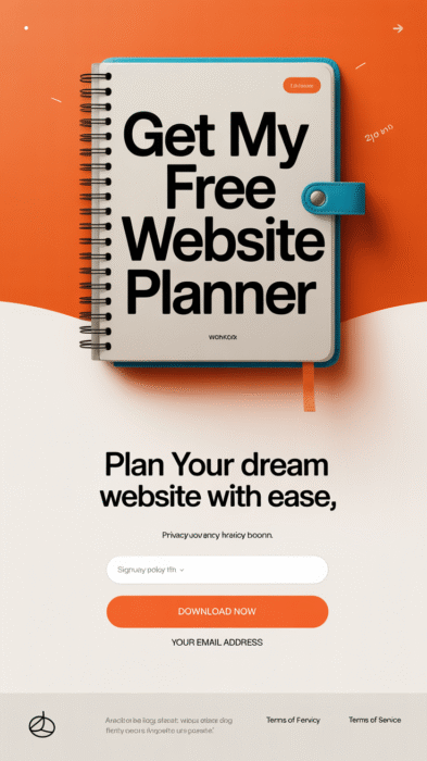
5. The “Freebie First” Layout
Perfect for: Service pros growing their email list
This layout revolves around a free resource like a quiz, ebook, or checklist. It’s ideal for anyone who offers services but wants to nurture leads before the sale.
Sections in Order:
- Eye-catching freebie promotion (hero section)
- Benefits of downloading
- What you do (services overview)
- CTA to learn more or contact
- Testimonials
Why it works:
It builds your email list and pre-sells your expertise.
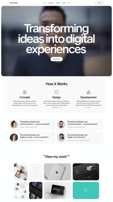
6. The “Client Journey” Layout
Perfect for: Service-based businesses with a step-by-step process
This layout walks people through your unique method or process. It’s great for explaining what it’s like to work with you — especially if you’re in design, branding, or coaching.
Sections in Order:
- Headline with transformation statement
- Overview of your process (Step 1, Step 2, Step 3…)
- Client results/testimonials
- Portfolio preview or past work
- CTA
Why it works:
It builds clarity and excitement. People know exactly what to expect.
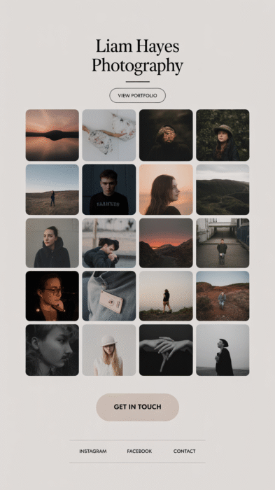
7. The “Portfolio Power” Layout
Perfect for: Designers, photographers, or creatives
This layout leads with visual proof. You let your work speak for itself before asking for the sale. Perfect for visual-heavy businesses.
Sections in Order:
- Hero image with short headline
- Featured portfolio items (images with links)
- About section
- Services breakdown
- CTA (“Let’s Work Together”)
Why it works:
People want to see what you’ve done before they buy.
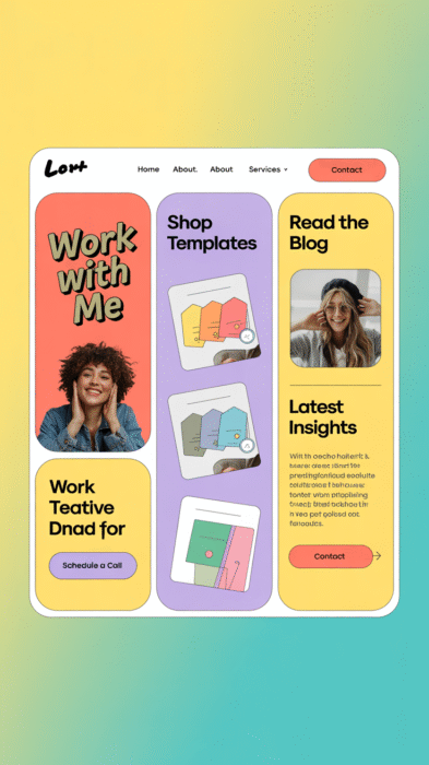
8. The “Hybrid Home” Layout
Perfect for: Multipassionate solopreneurs
Not everyone fits into one box — this layout gives you room to show off all the things. Whether you offer coaching + products + blogging, this layout handles it all.
Sections in Order:
- Value-driven hero section
- Menu or block grid with your offerings
- Freebie or blog opt-in
- Testimonials
- Latest content or Instagram feed
Why it works:
Visitors get the full picture of your brand at a glance.
Quick Tips to Make These Layouts Work for You
Keep your calls-to-action clear and consistent. Don’t overload your homepage with too many things to click — guide your visitor like a tour guide.
Stick to one main color palette and 1–2 fonts. This keeps everything looking clean and polished, even if you’re doing it all yourself. If you’d like help to choose your colors, use the free Website Color Palette Tool.
Always test your layout on mobile. Over half your visitors will view your site from their phone — make sure everything flows beautifully!
Pin it to plan it!
Make a Pinterest board with layout screenshots, favorite fonts, color ideas, and your must-have homepage sections. It’ll help you visualize what you’re building before you dive into the tech.
The Takeaway: Your Homepage Can (and Should) Work as Hard as You Do
You don’t need to be a designer to build a homepage that works. You just need a smart layout, strong visuals, and a clear plan.
Whether you want people to book a call, download your freebie, or learn about your services, one of these 8 layouts is ready to go.
Want even to learn more, check out my free Website Color Palette Tool which helps you find loads of cohesive colors for your homepage.