Web Design Inspiration Business
Let’s be real—choosing fonts for your website can feel a lot like picking a paint color. There are so many options, and you want it to look amazing, but where do you even start?
Whether you’re a DIY website builder, a creative entrepreneur, or a blogger designing your first homepage, typography matters. A lot.
Fonts tell your visitors what your brand is all about. They communicate personality, style, and trust before people even read a single word.
So today, I’m sharing 7 stunning font pairings that work beautifully for bloggers, creators, and small business websites. These combos are not just pretty—they’re intentional. Each one has a vibe, a purpose, and a design tip to help you use it well.
Let’s get inspired!
1. Modern + Warm: Montserrat & Playfair Display
Perfect for: Lifestyle bloggers, creators, or anyone going for approachable professionalism.
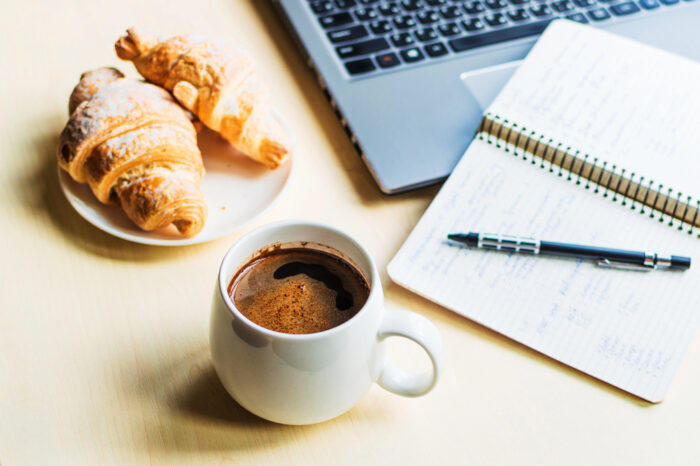
This pairing mixes clean modern sans-serif (Montserrat) with elegant serif (Playfair Display) to give you structure and warmth. Use Montserrat for body text and Playfair for headings or pull quotes.
Why it works: It’s bold enough for headlines, but still friendly and easy to read.
2. Clean + Bold: Lato & Bebas Neue
Perfect for: Creators with strong, minimal brands—like coaches, consultants, or digital product sellers.
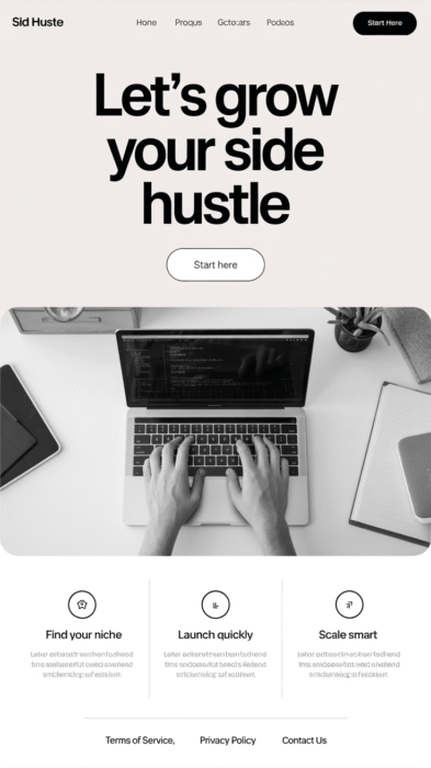
Lato keeps your paragraphs clean and readable, while Bebas Neue gives you a punchy, all-caps header. This combo says: I’m clear, confident, and ready to help you.
Why it works: Bebas Neue grabs attention without feeling too harsh, and Lato balances it out with polish.
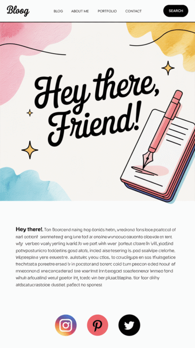
3. Whimsical + Sweet: Quicksand & Dancing Script
Perfect for: Creatives, artists, crafters, or mom bloggers who want a personal, cozy feel.
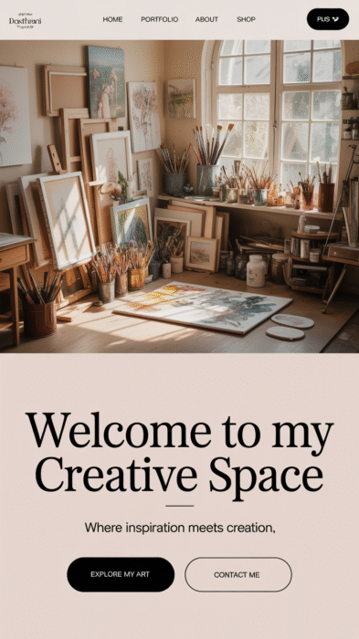
Quicksand is round and bubbly (but not childish), while Dancing Script brings in a handwritten touch for headings or section titles.
Why it works: It feels like a warm welcome—and it’s super brandable if your voice is casual and creative.
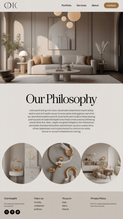
4. Elegant + Luxe: Cormorant Garamond & Raleway
Perfect for: Beauty bloggers, wellness brands, or anyone who wants a sophisticated, high-end vibe.
Cormorant Garamond adds drama and style to your headers. Pair it with Raleway for a sleek, modern body text that keeps things easy to read.
Why it works: It’s romantic without being fussy. Think boutique brands and high-end services.
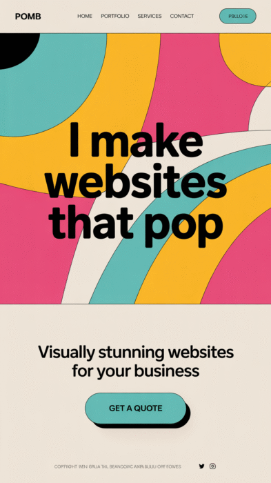
5. Trendy + Cool: Poppins & Archivo Black
Perfect for: Bold brands, personal brands, or creators in fashion, food, or YouTube.
Poppins is geometric and clean, and Archivo Black makes an impact for bold titles or headlines. This pairing has energy and confidence—and it looks amazing on mobile.
Why it works: These fonts were made for screens and create a modern, editorial-style look.
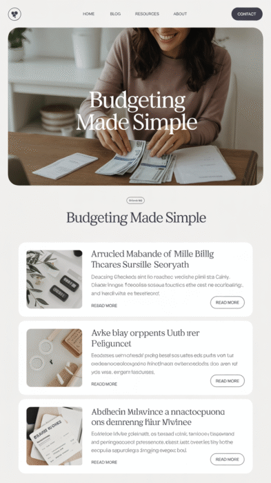
6. Classic + Calm: Georgia & Open Sans
Perfect for: Bloggers and businesses who want timeless readability.
This one might seem simple—but it’s a go-to for a reason. Georgia gives a classic, professional look to headings, while Open Sans keeps body text crisp and easy on the eyes.
Why it works: This pair never goes out of style and works great for long-form content.
7. Fun + Feminine: Pacifico & Nunito
Perfect for: Handmade businesses, personal brands, or bloggers with a playful, feminine tone.
Pacifico has a retro, cursive charm that works great for logos or section headings. Pair it with Nunito—a smooth, rounded sans-serif—for a combo that feels cute but still pro.
Why it works: It’s approachable and fun, but doesn’t sacrifice readability.
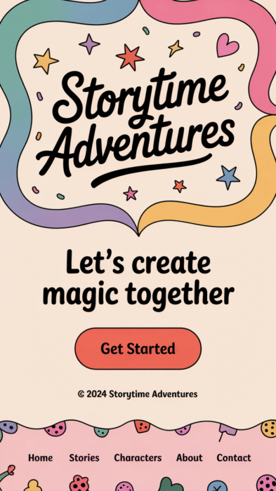
Bonus: How to Pick the Right Fonts for YOUR Brand
Choosing fonts isn’t just about what looks good—it’s about how you want your audience to feel.
Here are 3 quick tips to help:
1. Think about your tone. Are you formal or fun? Bold or calm?
2. Make it readable. Fancy is great, but not if your readers have to squint.
3. Use no more than 2–3 fonts. One for headings, one for body text, and maybe one accent font for extra flair.
And don’t forget—Pinterest LOVES font pairings. Try turning your favorites into:
- A branded Pin template
- A “Mood Board Monday” post
- A graphic that says “Typography Tips for Creators” with your fonts on display
Wrap-Up: Your Website, Your Style
Whether you’re building your very first blog or rebranding your creative biz, typography is one of the most fun (and impactful!) design choices you’ll make.
These font pairings are just the beginning—mix, match, and tweak until it feels like you.
And remember: you don’t have to be a designer to have a beautiful website. You just need a little inspiration, some thoughtful choices, and a touch of personality.
Pin your favorite combos, try them out in Canva or your theme builder, and have fun with it!
