
Building a website is exciting, but if you’re new to the game, the jargon can feel like a foreign language. Terms like “srcset” or “WCAG” might pop up, but where do you start? If you’re dipping your toes into UX design—the art of making websites user-friendly and enjoyable—some concepts are more critical than others. Here at webpageterms.com, we’ve narrowed it down to five must-know terms for beginners: User Experience (UX), User Interface (UI), Responsive Design, Typography, and Whitespace. Master these, and you’ll be well on your way to creating sites that people love to use. Let’s break them down.

1. User Experience (UX): The Heart of It All
Imagine visiting a website that’s confusing, slow, or just plain frustrating. That’s bad User Experience (UX) in action. UX is all about how someone feels when they interact with your site—think ease of navigation, speed, and satisfaction. It’s the big-picture goal of UX design: making sure users don’t bounce away in annoyance.
For beginners, UX is the starting line. Before you tweak colors or layouts, ask: “Does this help my user?” A site with great UX might load fast, have clear menus, and guide visitors to what they need without a headache. Think of it like hosting a party—if your guests can’t find the snacks, they’re not sticking around. As you build your site, keep UX in mind; it’s the foundation everything else rests on.
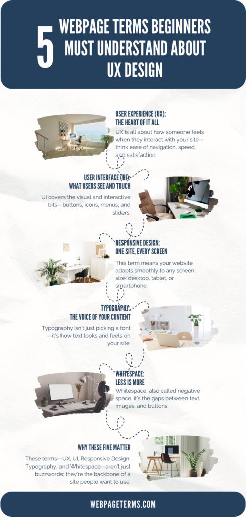
2. User Interface (UI): What Users See and Touch
If UX is the feeling, User Interface (UI) is the face. UI covers the visual and interactive bits—buttons, icons, menus, and sliders. It’s the part of your site users click, scroll, and stare at. Good UI makes UX possible by turning abstract goals (like “easy navigation”) into tangible design choices (like a big, bright “Sign Up” button).
For newbies, UI is where creativity meets practicality. A cluttered UI with tiny text or confusing icons kills the experience, no matter how solid your UX plan is. Start simple: clear labels, consistent colors, and clickable elements that look clickable. UI is your first handshake with users—make it friendly and firm.
3. Responsive Design: One Site, Every Screen
Ever visited a site on your phone that looked like a desktop disaster—squished text, broken buttons? That’s what happens without Responsive Design. This term means your website adapts smoothly to any screen size: desktop, tablet, or smartphone. In 2025, with mobile traffic dominating the web, it’s non-negotiable.
Beginners need to grasp this because users expect flexibility. A responsive site uses flexible layouts and images that resize automatically, so your blog looks as good on an iPhone as it does on a laptop. Tools like CSS media queries (don’t worry, you’ll get there) make this happen. Test your site on different devices early—it’s a quick way to spot where responsiveness saves the day. Not sure where to host a responsive site? Check out our Web Hosting Comparison Tool for options that support fast, flexible designs.
4. Typography: The Voice of Your Content
Typography isn’t just picking a font—it’s how text looks and feels on your site. Font style, size, spacing, and alignment all fall under this umbrella, and they’re huge for UX. Why? Because users read (or skim) your content, and bad typography makes that a chore.
For beginners, typography is a secret weapon. Choose legible fonts—sans-serifs like Arial or Roboto are safe bets—and keep sizes readable (16px minimum for body text). Use bold headings to guide eyes and avoid cramming letters too close. Good typography creates hierarchy, so users know what’s important at a glance. Bonus tip: Pair it with our to match fonts with vibes that pop.
5. White space: Less Is More
Don’t skip Whitespace—it’s not “empty” space, it’s intentional breathing room. Also called negative space, it’s the gaps between text, images, and buttons. Too little, and your site feels like a crowded subway; too much, and it’s a ghost town. The sweet spot? A clean, focused layout.
Beginners often overstuff pages, thinking more content equals more value. But whitespace boosts readability and keeps users from feeling overwhelmed. Look at Google’s homepage: tons of whitespace, one clear focus. Start by spacing out paragraphs and padding buttons—it’s a small tweak with big impact. Your users will thank you with longer visits.
Why These Five Matter
These terms—UX, UI, Responsive Design, Typography, and Whitespace—aren’t just buzzwords; they’re the backbone of a site people want to use. UX sets the goal, UI builds the bridge, Responsive Design ensures access, Typography delivers the message, and Whitespace keeps it digestible. Together, they turn a random webpage into a user-friendly experience.
New to this? Don’t sweat the advanced stuff like “srcset” or “WCAG” yet—those come later. Focus on these five, and you’ll avoid rookie traps like cluttered designs or mobile-unfriendly layouts. Want to see them in action? Explore our Website Hosting Comparison Tool to find platforms that make UX design a breeze, or play with our to nail typography and whitespace vibes.
Start Simple, Grow Smart
UX design can feel overwhelming, but it’s really about solving problems for users. Start with these terms, test them on your own site, and watch how small changes—like bigger fonts or more whitespace—lift engagement. Building a website isn’t just tech; it’s empathy in pixels. Get these five down, and you’re not just a beginner—you’re a UX thinker.