
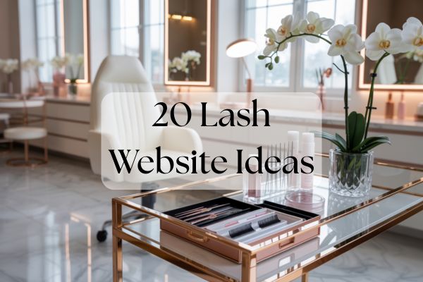
If you want more bookings without living on Instagram, your website has to pull its weight. These lash website ideas focus on layouts, color choices, copy, and booking flows that make it easy for clients to say yes. Use them as plug-and-play building blocks, no design degree required.
What makes a lash website convert?
Start with clarity. A single goal, a clear path, and trust up front. Quick wins include a strong hero message with one primary button, mobile-first design that loads fast, and above-the-fold trust markers like reviews, certifications, and hygiene standards.
Here are 20 lash website ideas you can copy or adapt today.
1) Lead with a clear hero message and one primary button
Say exactly what you do and who it is for, then offer one choice: Book Now. Try headlines like:
- Effortless lashes, every morning.
- Custom lash sets that fit your life.
- Lashes that last, applied with care.
Use secondary micro-CTAs sparingly like See availability or Book your patch test.
2) Design mobile-first and prioritize speed
Most clients browse on phones. Use compressed images, short video clips, and no heavy scripts. Test load time, remove unused apps, and choose a lightweight theme so the first screen appears in under two seconds.
3) Put trust markers above the fold
Feature star ratings, 1 to 2 short review quotes, sanitation and certification badges, and a quick hygiene line like Freshly sanitized tools for every client. Add a friendly headshot to humanize the brand.
4) Include must-have sections on one clean homepage
Add a services snapshot, three to six portfolio highlights, rotating reviews, quick FAQs, and contact details with a map. Link to full policies and pre or post-care pages in plain language.
5) Keep a consistent visual vibe
Pick a tight color palette, use two to three fonts maximum, and give elements room to breathe. Download my free Color Palette guide for lash brands to pick a palette in minutes.
6) Copy this Minimal Modern homepage wireframe
Hero with a clean image, bold headline, and Book CTA. Add three service cards with short benefit lines. Include a before or after slider, then three quick reviews. End with FAQs and studio details.
7) Try a Spa Luxe homepage
Use a soft neutral palette and elegant serif headlines. Add an Experience section with studio photos and sensory cues like calming music and heated bed. Tease memberships or maintenance plans near the booking button.
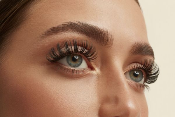
8) Go Bold Glam if that matches your brand
High-contrast colors, a short punchy headline, and a video hero showing application close-ups. Add an As seen on strip with brands or creator shoutouts and a Book this look link under featured photos.

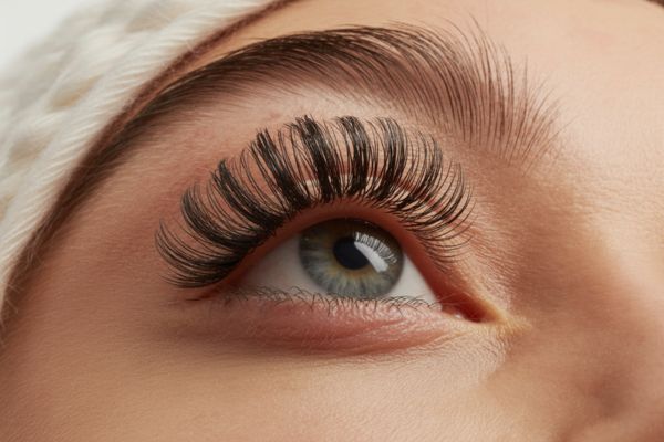
9) Choose a Soft Neutral palette
Ivory, Nude, Warm Taupe, and Charcoal for text. This suits spa or natural looks and pairs well with sunlit photography.
10) Choose a Clean Clinical palette
White, Cool Gray, Slate, and a gentle Sage accent for a professional, hygienic vibe. Works with crisp lighting and minimalist layouts.
11) Choose a Glam Contrast palette
Blush, Black, Champagne, and subtle Gold accents for upscale glam studios. Keep gold for thin lines or icons, not big blocks.
12) Choose a Playful Pastel palette
Lilac, Shell Pink, Mist, and Deep Plum for youthful brands that feature hybrid or wispy styles. Balance with lots of white for clarity.
13) Pair fonts that are easy to read
Serif plus sans is timeless, like Playfair Display for headlines and Inter for body. For modern vibes, try Poppins with Source Sans 3. For elegance, Cormorant with Montserrat and a subtle script just for short headings.
14) Bake in accessibility from the start
Aim for 4.5:1 contrast on body text, minimum 16 px body size, and 1.5 line height. Avoid text over busy images. Provide alt text for key images like before or after photos.
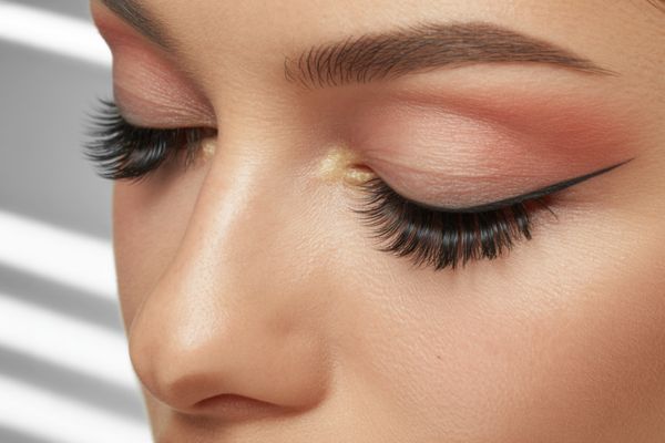
15) Write benefit-first service cards
Structure each card with Name plus result-focused subtitle, What is included, Duration, Ideal for, Price. Add a small before or after thumbnail and a Book button. Example: Classic Set, Soft definition that saves your morning routine, 90 minutes, Ideal for mascara lovers, $X.
16) Be transparent with pricing
Create a clear chart of full sets versus refills by weeks. Offer bundles like a three-refill pack and a maintenance membership with small perks, for example complimentary lash bath once a month.
17) Explain care and policies in plain language
Post a short pre-care checklist, arrive makeup-free and avoid caffeine, plus post-care basics, keep lashes dry for 24 hours, brush daily. Use simple explanations for deposits, no-shows, and late arrivals. Add a patch test policy, sensitive clients welcome.
18) Design a frictionless booking flow
Keep steps simple: choose service, pick time, enter contact details, pay deposit, confirm. Show real-time availability and service durations. Send email and SMS confirmations, include a calendar add-to link, and attach a pre-appointment checklist.
19) Offer helpful options at checkout
Upsell small add-ons like brow tint or lash bath. Include a waitlist toggle if no times are available. Provide a self-serve reschedule link and flexible deposit terms within a timeframe to reduce no-shows.
20) Build social proof that converts
Create a gallery organized by style, Classic, Hybrid, Volume, Wispy, with consistent lighting and angles. Use review cards with star rating and a benefit-led line plus first name or initial. Embed an Instagram grid with Book this look links and add short TikTok or Reels tutorials. Show certifications, sanitation badges, and brand partners. In your About section share your story, training, specialties, and client philosophy. Include a friendly headshot and studio vibes. Add click-to-call, SMS or WhatsApp, email, a Google Map embed, and parking or access info. Note wheelchair access and scent-free options to welcome everyone.

Tools and templates to speed you up
- Website platforms: Squarespace for clean and easy, Wix for visual freedom, Shopify if you retail products alongside services.
- Booking systems: GlossGenius, Fresha, Square Appointments, or Vagaro. Pick one that supports deposits, reminders, and upsells.
- Plug-and-play sections: Use a homepage wireframe like Minimal Modern or Spa Luxe, a reusable service card template, a short FAQ template, and a plain-language policy section.
- SEO quick wins: Optimize pages for lash extensions plus your city and service variants, for example wispy lashes in [City]. Create a Google Business Profile, add local schema, and build neighborhood location pages with directions and parking notes.
Launch checklist
- Test on mobile, run a speed check, set a favicon and a friendly 404 page, and add a cookie banner if required.
- Click every CTA, submit every form, and test booking reminders end to end.
- Proofread headlines, confirm hours and pricing, and make sure your address or service area is correct on every page.
Pick one or two ideas to implement this week. A clearer hero section, a faster mobile experience, and a simpler booking flow can lift conversions fast. Your best marketing is a site that looks like you, reads like you, and gets clients booked without friction.